Malpertuis Lenormand
Card dimensions are 63mm x 88mm. Cards are printed on 350gsm board, finished with UV varnish, and edged with dark gilt. Cards come supplied in a specially designed tuck box.
Learn More
For a long time I paid little attention to Lenormand. Probably like many others, I'd always concentrated on the subtlety and symbolism of Tarot and had never considered any other oracles that important or necessary. I've never really regarded Tarot as 'cartomancy' - I've always believed that it's quite possible to understand and use Tarot at a purely intellectual level, without needing to believe in any magic behind it. The images in what Lenormand decks I'd seen felt random and arbitrary by comparison.
So I initially found it hard to treat Lenormand seriously, and my limited awareness hadn't led me to a particularly positive view. Here I think I was affected by my own studies of Tarot history: most of the reading I'd absorbed over the years had emphasised the heritage of Tarot while dismissing other systems as the province of charlatans. I also had my own slightly superior theories about the Lenormand revival. Such a simple divination system seemed to me to be 'cartomancy for the Google generation' - in other words, the emergence of a new type of reader expecting instant answers without being prepared to invest very much effort in either study or interpretation. Ask your question and lay three cards... it all felt much too easy.
So I was coming from a sceptical standpoint. But there existed many people out there who were quite convinced that Lenormand did work - could they really all be wrong? I gradually realised the need to put aside my own prejudices and accept Lenormand as a different system with its own rules and boundaries. Rather than dismissing it as a poor man's Tarot. I needed to accept it for what it was - Marcus Katz and Tali Goodwin's distinction between the 'T-space and the L-space' was very influential on my appreciating this difference. Their book Learning Lenormand explains this very clearly and simply.
Exposure to different Lenormand decks also helped me feel more comfortable with the images: as I studied different styles of deck, I found it easier to recognise that I'd only been dismissing the images as random because I'd been so wedded to Tarot imagery for so long.
I began designing the deck in early 2014, I had little idea at first of how I wanted the deck to look, other than the vague idea of its complementing my own tarot deck, the Tyldwick. I'd received Independent expressions of interest in a 'Tyldwick Lenormand'. So it seemed to make sense.
When I'd created the Tyldwick Tarot, I'd been very keen on the idea of the reader projecting themselves into the images, so had layered the designs with many different levels of information to create a very specific atmosphere. I'd set out to create a deck which didn't reveal everything insanely and which, ideally, would create something of a state of hypnosis in the reader to allow them to access their own intuition. Within the Tyldwick, every card was designed to contain a strong narrative of its own, and initially I intended to apply these same aims and principles to this new Lenormand deck.
I soon discovered that I'd need to rethink this approach - suggestion or mystification just didn't fit with Lenormand. My earliest designs were rightly criticised for being too difficult to recognise immediately - particularly within larger spreads. The smaller card size also meant that including too much information just looked messy and confusing. But, most importantly of all, I realised that trying to create a narrative within individual Lenormand cards wouldn't work in the way it can for Tarot. As soon as a narrative enters into a Lenormand card, the card immediately becomes less effective. So symbolism was out, and the images needed to be relatively simple.
This involved quite a major change in style. While I still hoped to maintain some connection to the Tyldwick in terms of overall 'feel', I realised that the deck needed to be a cousin rather than a sibling. I fried many different approaches, and reaching a final style was quite difficult. I'd thought that designing Lenormand would be easier than designing Tarot, but often it was actually harder. Without symbolism and detail to fall back on (Irecognise now just how heavily I'd relied on those to give the Tyldwick its distinctive flavour), images needed to stand up much more on their own.
The process of designing the deck constantly surprised me. I'd dreaded having to design cards with animals or people but these cards in fact came together quite quickly. Needing to give the Man, Woman, and Child costumes forced me to decide on a historical context - but overall those cards didn't present me with too many headaches. Instead, the hardest cards were the ones which I'd imagined would be easiest. The simpler card images (Ring, Book, Letter, Heart) proved very difficult. The simplicity of these cards made it hard to 'fill the space' or to create any kind of atmosphere without resorting to the kind of background detail which I'd already identified wouldn't work fo this deck.
My solution came from a surprising source - the inserts. I debated for ages whether or not to include inserts. While I appreciated the advice I received on both sides of the argument, I don't feel that anyone's really got a definitive answer on what the inserts are actually all about. They're just 'there', and have been for so long that they're now part of Lenormand's heritage... whether or not anyone can explain why. And - struggling as I was to create some atmosphere or mystery within the deck - I embraced inserts as a source of fascination rather than frustration, because I realised that they provided at least a partial answer to my problem.
Inserts would allow me to include a suggestion of intrigue to cards which could otherwise just end up feeling too flat. I'll admit that this decision was something of a design trick, and that I'm laying myself open to accusations of including the inserts in an attempt to be deliberately obscure. But obscurity wasn't my intention - I'd rather say that I hope the inserts make the cards more interesting.
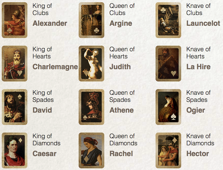
The court card inserts presented a particular challenge: traditional courts didn't really suit the overall style of the deck. After many experiments with heritage decks (none of which worked) I decided that I needed a different solution.
I used images based on the traditional French attributes:

Sourcing insert images took time, especially given the need to identify only images which were available for use. I had to create three original images (Argine, La Hire, and Ogier), since no suitable artworks already existed.
One final note on the name of the deck. When I first starting posting images of early designs online, some people immediately christened the deck the 'Tyldwick Lenormand'. I hope that I've explained sufficiently in the account above why I ended up not using this name. The final deck is, I believe, some way distant from what I'd originally intended, and to call the deck the 'Tyldwick Lenormand' just didn't feel entirely appropriate. It's travelled too far from the Tyldwick Tarot, and asserted its own identity too strongly, to share its name. Hance why I've called it the Malpertuis Lenormand.
I hope you enjoy the final deck!
Neil Lovell
