12Jul

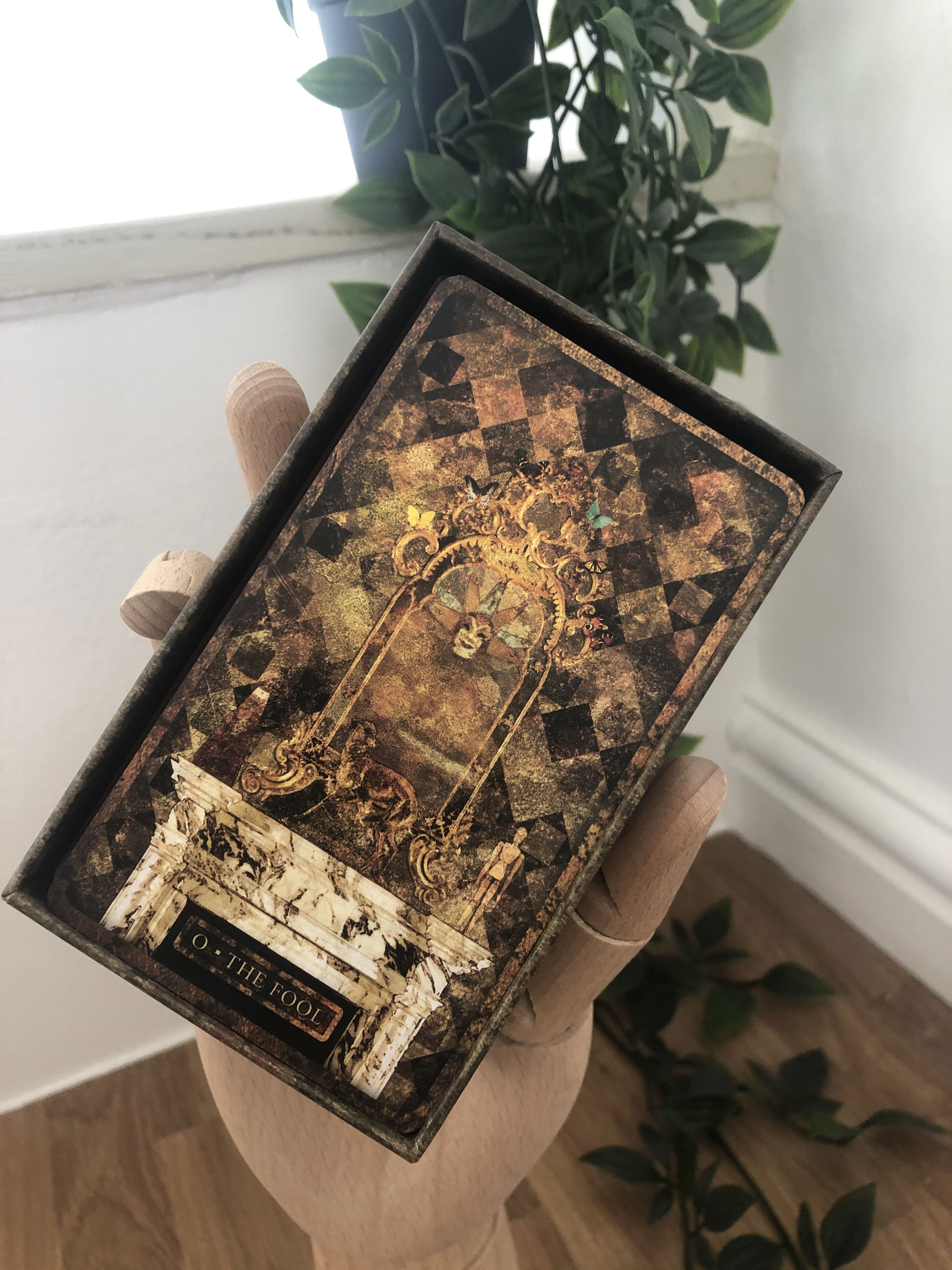
Only 25 years in the making!


Neil began the design of this deck way back in 1999, and spent nearly 2 years working on the art work and the overall concept. The Nijinsky was his first serious attempt at designing his own deck, using images of historical figures to create this unique set of cards.

All that remains of all this work is a single CD containing some very poor quality jpeg files, and some print outs on standard printer paper, so this deck sat in a draw for 25 years waiting to see the light of day. Many hours have been spent cleaning up these original images, most likely done in Photoshop 5, the blacks in particular were not as dark as they now appear, making the originals rather grey and washed out. The font was blurry, as the contrast between the black and white wasn't crisp enough, in fact most of the colour edges were undefined and bled into one another.

The style and general content of the images is so unlike any deck that has been produced under the Malpertuis brand, and this has contributed this long period of time in limbo. There has been a mixed reaction to these cards, those who were lucky enough to see and remember them from 1999/2000 were keen to finally see them in print, but the radical move away from the Malpetuis style was not of such keen interest to most people.

It is with this in mind that only 500 copies have been printed thus far, should the deck receive the attention I feel it deserves I will extend the print run.
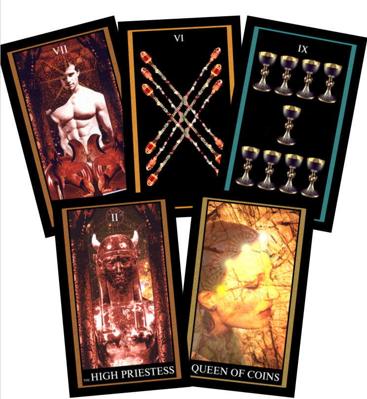
Over the years Neil designed cards, I often wondered why he had several projects on the go at any one time, they were never really connected in style or composition, if anything they tended to be almost polar opposites.

Having been working on the Calicut Lenormand for a while and constantly reviewing several of the cards as the feel or look isn't right, and don't get me started on the border design!  This idea of something so different now makes perfect sense, which brings me to the Nijinsky Tarot.

This deck began its life many years ago as an actual colage, with Neil physically cutting up magazines and glueing the images together, and as graphic design became more accessible these ideas eventually made their way into a digital format.

The deck as it is today started out in 1999 and over the next 2 years was slowly developed, incorporating Neil's love of history and tradition into each card. The only digital files that remain from these early designs are poor quality or slightly corrupted jpeg files, so while needing a break from other work I began to tidy these up.

No design changes have been made, but it seems that the surviving images may have at some point been printed and then scanned, as several of the darker image show faint print lines, so these have been removed and the black colouring brought back to life, as this had faded into grey on several of the images.

Which now brings the question, to print or not to print?

Being Neil's original work and never before put into print I'd be grateful for your thoughts and comments. A few of you may even have spoken to him about these cards and have information about them that I don't.

The printing is now complete!

This is now the final week to place your pre orders for this latest edition of the Tyldwick tarot, the closing date is Friday 5th May.

The general release for the deck will be announced later, once all pre orders have been shipped.


The pre-sale for the 10th anniversary edition of the Tyldwick tarot is now live.
I have no definite release date, as the deck has only just gone to print, so keep your eyes open for updates as they come in. 

05Sep

The matchbox Lenormand is a brand new deck.

Beginning as side project to distract from other decks Neil had begun, the Matchbox, was originally an exercise in fun, drawing on the designs and graphic style of vintage eastern European matchboxes he had seen during his previous career.

The simple graphic style and limited colour palette made this an obvious starter project for me to begin to cut my teeth on. Having looked over several of Neil's projects, this deck was by far the easiest to continue. Several ideas had been formed for Tarot decks, and while the basic 'pip' cards create little problems from an artistic point of view (mostly as its these cards Neil produced first), the court cards prove much trickier, especially with no clear idea of the design ethos he was looking for. 

These cards represent my first true steps to continue the Malpertuis brand, finalising packaging and producing second editions are one thing, but to complete one of Neil's projects is an important step for me.

The design ideas and concepts aren't the issue, but matching Neil's exacting standards of design are proving a challenge, one that given more time and experience I hope to be able to live up to.

05Sep

I'm pleased to announce the return of the Chelsea Lenormand. After the mystery of the missing Heart on some of the Rider cards in the original, this seemed the perfect time to issue a second edition.

In a similar style to other reprints, this deck retains the same imagery and colour palette as the original, but the metal tin has been replaced with a more traditional box and lid. As much as I love those little tins, they were far too easily dented and damaged.

The deck still contains the booklet, detailing the history and meanings of Lenormand, along with a few examples spreads. This will be available as a PDF soon, as I'm well aware the font of the booklet is tiny! 

03Jan

Following on from the hugely successful reprint of the Tyldwick Tarot, it is now joined by its partner deck


I'm please to announce the launch of the Malpertuis Lenormand 2nd Edition.

The deck has under gone a similar re-work, as the Tyldwick, with minor colouring changes to the rear face of the card, making to the two decks much closer in finish, along with an alignment of the edge banding.

All the original artwork has been retained, with the card quality and finish now brought in line with the 2nd Edition Tyldwick deck, making these 2 decks the perfect partners fro each other.


I can't believe what a phenomenal response there has been to the launch of the 2nd edition. I knew there would be interest, but this has far exceeded my wildest dreams.

I would like to thank everyone who has ordered a copy and those who have sent messages of support. To all those who have placed an order, can I please ask for a little patience, I'm more than a little overwhelmed with the work load right now, but please rest assured all your orders are being processed and shipped. Trust me this is a lot of work for 1 person!!

Thank you!


Joe

23Apr

A long awaited tribute to Neil

With the phenomenal success of the original Tyldwick deck, it seemed the logical way to pay tribute to Neil. A deck that for many was his greatest masterpiece.

Although the packaging and edging may have changed, the magic and mystery of the original artwork has been retained.

There may seem to be only minor changes, but each one has been a hard fought battle with myself! I can safely say however, I'm over the moon with the result, and can only pray that Neil would be proud of the work I have done in his absence.


I have been inundated with messages about this deck since posting the last update, mostly asking questions about preorders and arrival times.

So I'll answer everything here.

Due to the fact that I only operate Malpertuis part time, I've made the decision not to offer preorders, but please rest assured there will be more than enough copies for all those that want one.

They will be available for purchase through the website once I have had an opportunity to examine the final quality and am satisfied that they meet the high standards set by Neil, and at the original price (£60).

25Mar

The new 2nd Edition of the Tyldwick is nearing completion.

The printing has been completed, the cards are currently under going a quality inspection before being cut, and having the edging added.

I should have a shipping date within the next week.

Not long to wait now!!

13Nov

I know some of you have requested a more easily readable format for the LWB which came supplied with the Legend of the Wizard Laird deck. The poker sized booklet being especially difficult to read due to the small font size. 

The PDF version has now been added to the site for you to download and enjoy in all its glory, without the need to strain your eyes! Sorry it took so long!!


Joe